Shelter
UX Design - Visual Design / Logo Design -
Responsive Design - UX Research
A disaster alert service and emergency preparedness information.
The typical user ranges from teenagers to older people and from all backgrounds.
(created for Google UX Design Certificate)
Dec 2022 - Mar 2023
UX Design - Visual Design / Logo Design -
Responsive Design - UX Research
A disaster alert service and emergency preparedness information.
The typical user ranges from teenagers to older people and from all backgrounds.
(created for Google UX Design Certificate)
Dec 2022 - Mar 2023

Challenge
A need for reliable communication with designated contacts in the event of a disaster or emergency situation, along with language assistance for those traveling in Japan.Goal
To design an improved app and website to provide information, guidance and communication services to people residing in or visiting Japan.User
One of the determined needs of users identified was to address problems associated
with notifying designated contacts, or being able to communicate in another language without stress.
Users encountered frustration and nervousness when feeling like their contacts were not able to be reached or updated when necessary.
Problems were faced by users who do not speak the native language and would like to be able to communicate in another language during an emergency without problems.
Users encountered frustration and nervousness when feeling like their contacts were not able to be reached or updated when necessary.
Problems were faced by users who do not speak the native language and would like to be able to communicate in another language during an emergency without problems.
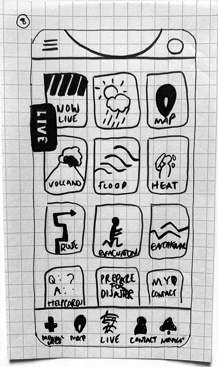
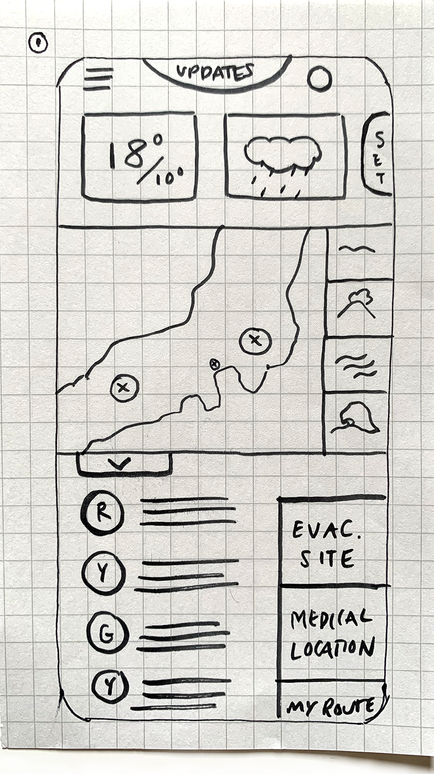
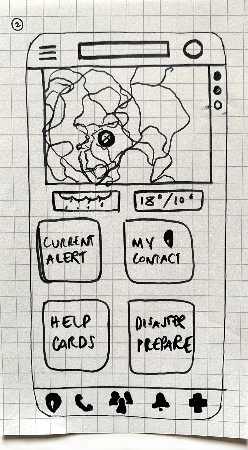
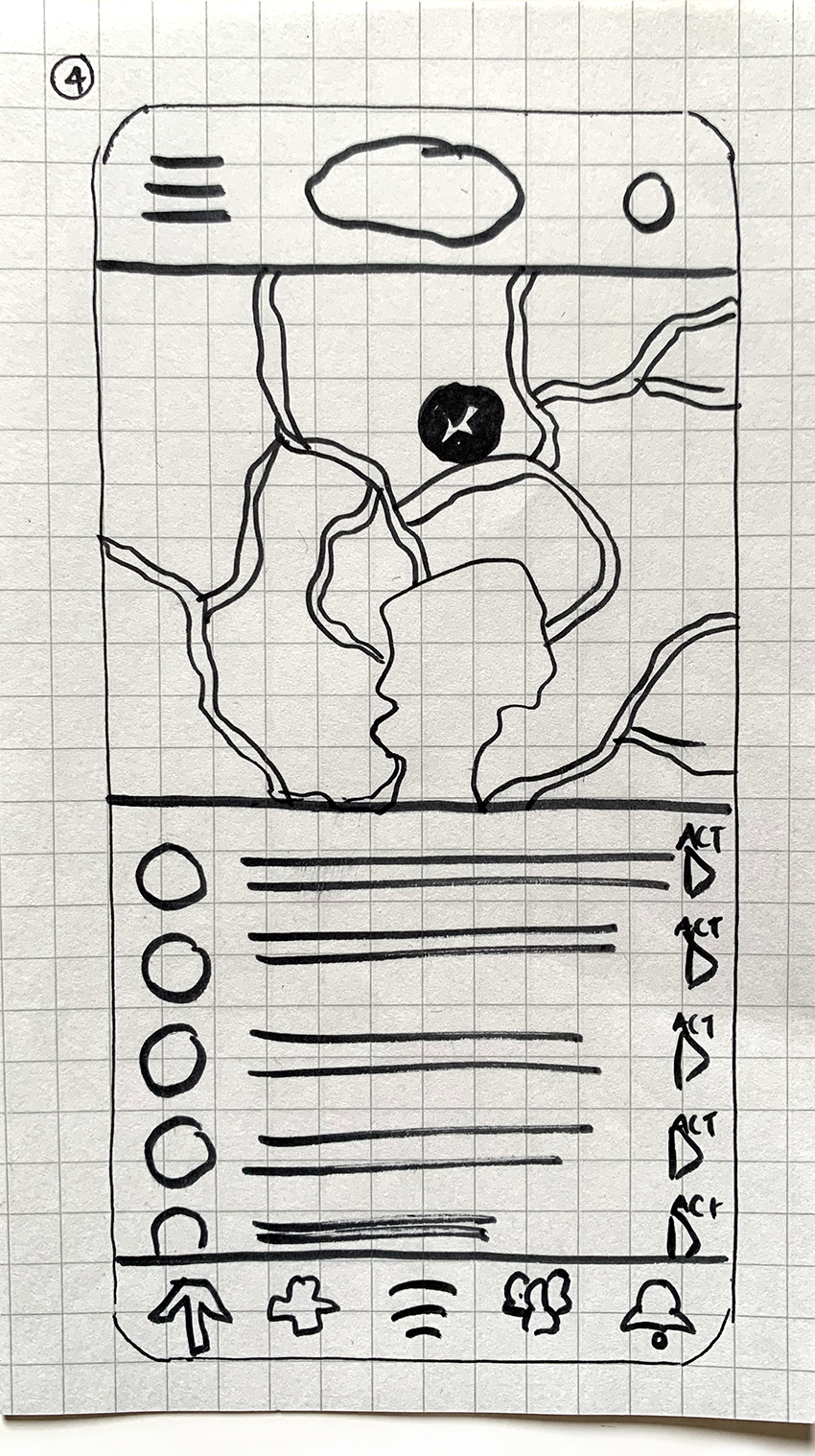
Wireframes
I created some ideas based on the gaps which were identified in the competitive audit. The focus of the ideas was on including ways to track safety; provide guidance and ways to translate language.
Mobile Wireframes

Digital Wireframes
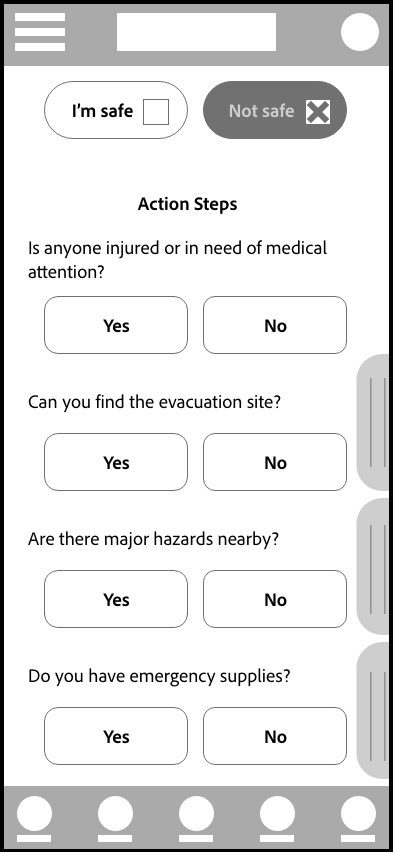
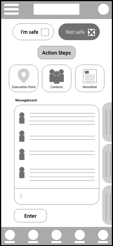
After creating the paper wireframes these were then turned into digital wireframes whereby elements could be further refined to reflect the initial concepts.
Mock ups
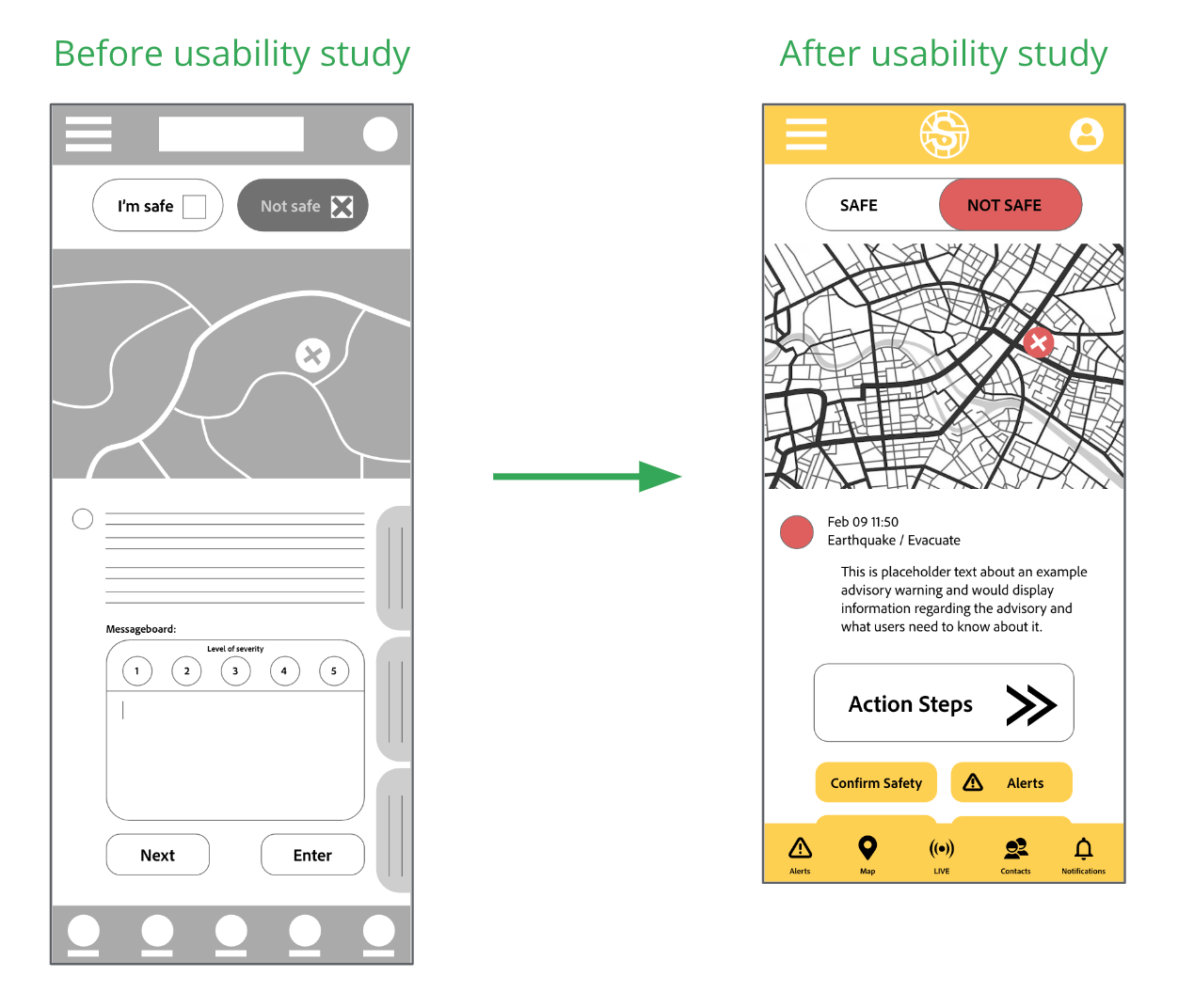
After conducting the usability study, changes were made to the wireframes to include a clearer navigation path from the start page including arrows and a color code.
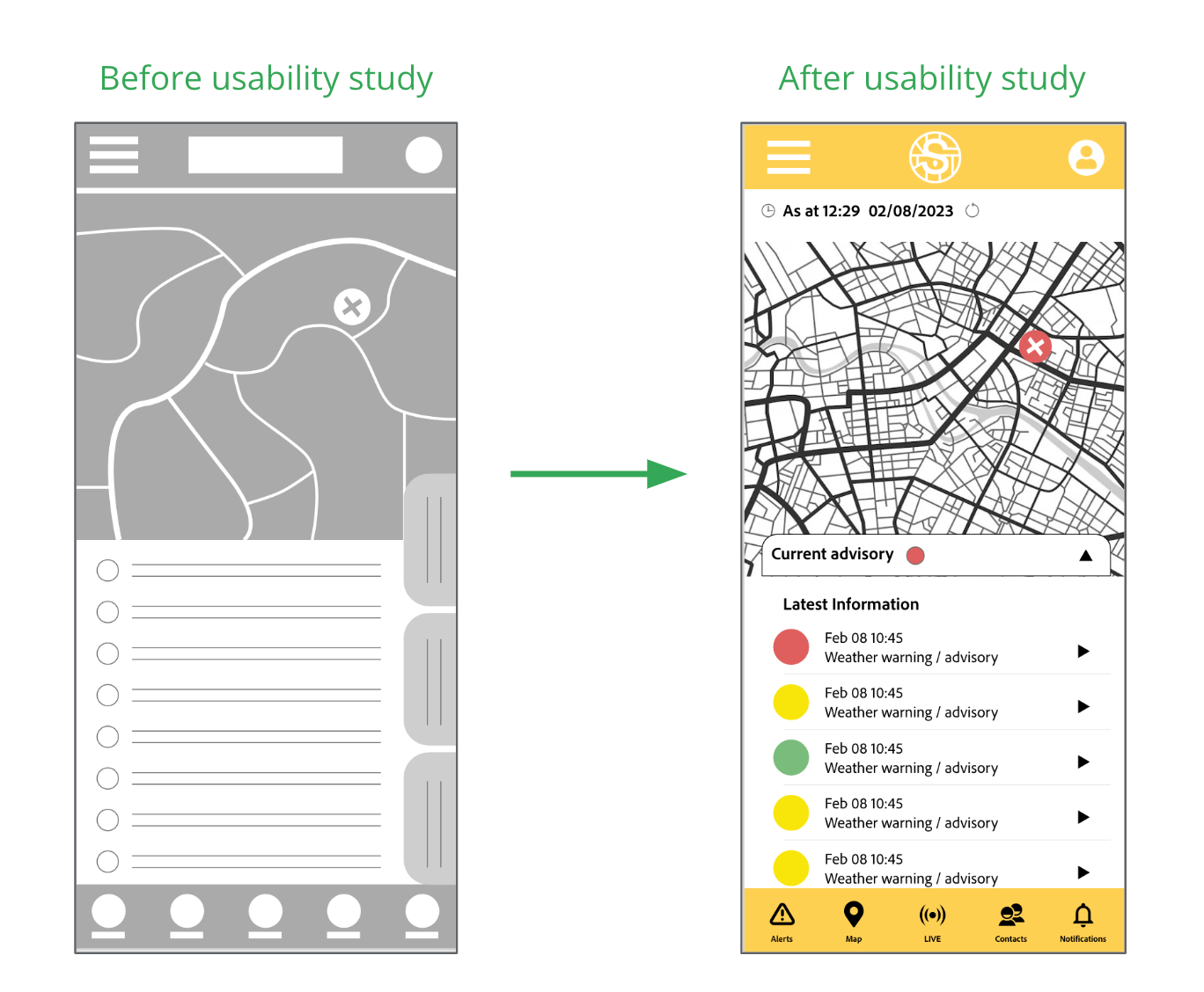
Another area which was updated following the insights discovered in the usability study included changing the hierarchy and placement of items: placement of the message board on the ‘Not Safe’ screen.
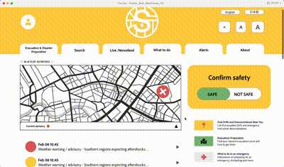
Final Mock ups
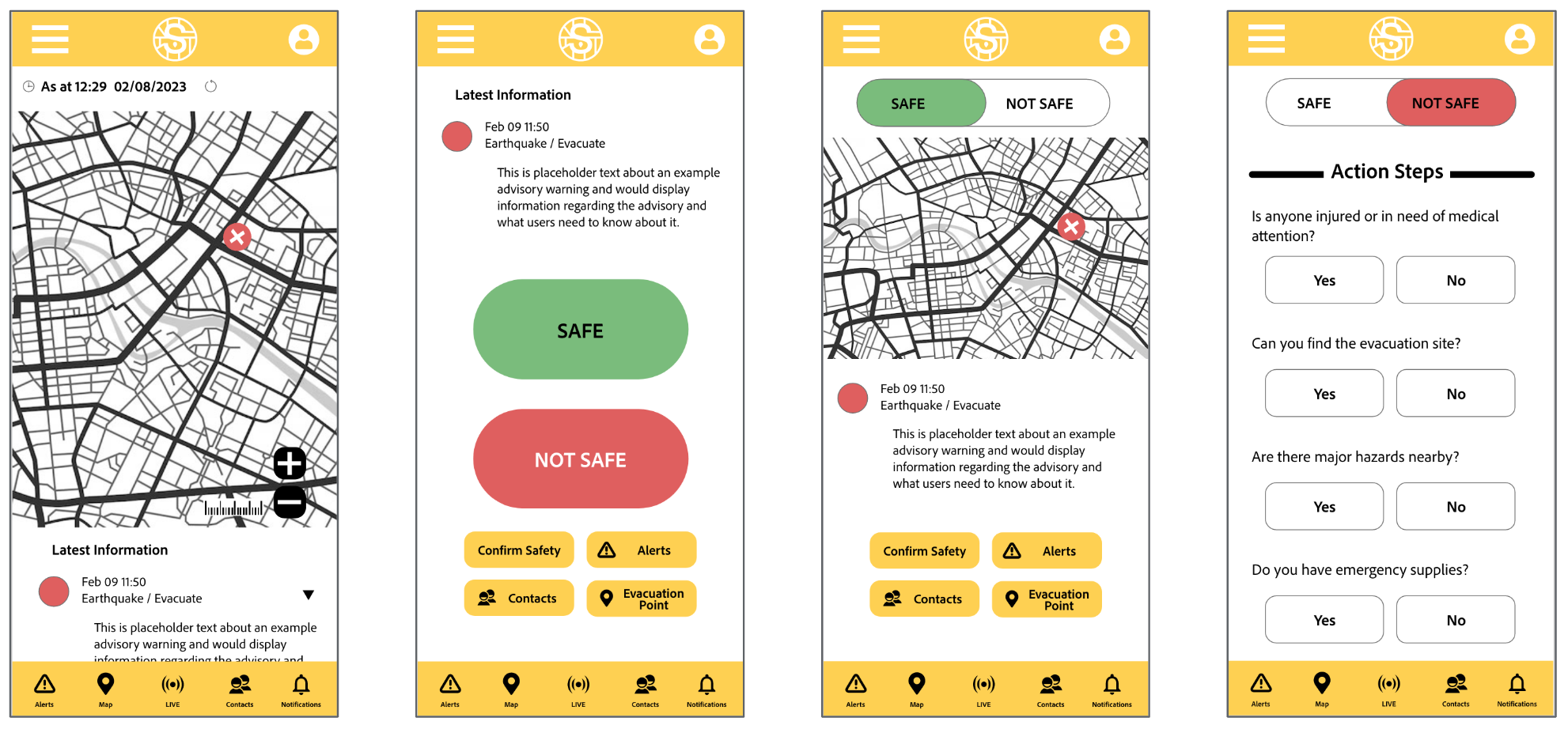
High-fidelity Prototype (mobile)
Changes were applied to the design of the main user flow and updated in the high-fidelity prototype.

Accessibility considerations
Accessibility considerations
Labels were used for the main navigation buttons in the footer to be accessed by screen readers.
The size of the buttons to choose ‘Safe’ or ‘Not safe’ were made at a large size to increase accessibility and take into account emergency conditions which could affect ability to make a selection on the screen (shaking; restricted movement; lighting conditions).
Color-coding for the alerts has been included to assist with clear understanding of the level of severity.
Sitemap
A site-map was then created to determine the display of elements on the website and maintain consistency across devices.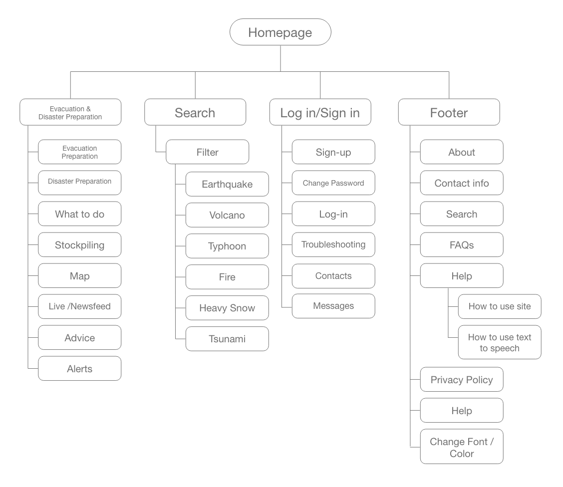
Responsive
Designs for screen size variation included: mobile; desktop and tablet.
The designs were applied to each screen and the elements were optimized to match the size and functionality.

Testing & Feedback
The feedback of the app and website has been positive whereby users felt it would help them to feel more confident their contacts would be able to locate where they are in the event of a disaster or emergency.
Quote from peer feedback
“This would help me feel more at ease knowing my contact has access to my safety notification without having to send them a text or email outside of the app itself.”
What I learned
Including a quick active ‘Safe’ and ‘Not safe’ button to allow users to immediately alert others of their situation has created a sense of security for some users. Providing streamlined steps about how to respond in an emergency creates a smooth process to assist users with guidance in unstable and unpredictable situations.
User Flow